Introduction to MACD Histogram
The Moving Average Convergence Divergence (MACD) Histogram is a popular tool among technical analysts and traders. The MACD Histogram is used to forecast price trends and potential buy and sell signals. It is a trend-following momentum indicator that shows the relationship between two moving averages of a security’s price.
Understanding the MACD Histogram
The MACD Histogram consists of the MACD line, the signal line, and the histogram. The MACD line is calculated by subtracting the 26-period Exponential Moving Average (EMA) from the 12-period EMA. The signal line is a 9-period EMA of the MACD line. The histogram represents the difference between the MACD line and the signal line.
MACD Line
The MACD line is the faster line on the MACD histogram. It reacts more quickly to changes in the price of a security.
Signal Line
The signal line is the slower line on the MACD histogram. It reacts more slowly to changes in the price of a security.
Histogram
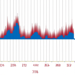
The histogram is the bar graph that shows the difference between the MACD line and the signal line. It gives traders a visual representation of the speed and magnitude of price movements.
Interpreting the MACD Histogram
The MACD Histogram can be interpreted in several ways to generate trading signals. Here are some of the most common interpretations:
Bullish and Bearish Crossovers
When the MACD line crosses above the signal line, it generates a bullish signal, indicating that it may be a good time to buy. Conversely, when the MACD line crosses below the signal line, it generates a bearish signal, indicating that it may be a good time to sell.
Positive and Negative Divergence
Positive divergence occurs when the price of a security is making new lows, but the MACD histogram is failing to make new lows. This could indicate that the downtrend is losing momentum and a bullish reversal could be on the horizon. Negative divergence occurs when the price is making new highs, but the MACD histogram is failing to make new highs. This could indicate that the uptrend is losing momentum and a bearish reversal could be on the horizon.
Centerline Crossovers
When the MACD line crosses above the centerline, it generates a bullish signal. When the MACD line crosses below the centerline, it generates a bearish signal.
Conclusion
The MACD Histogram is a versatile tool that can help traders identify potential buy and sell signals. By understanding how to interpret the MACD Histogram, traders can gain a better understanding of market trends and momentum. However, like all technical analysis tools, the MACD Histogram should be used in conjunction with other indicators and analysis techniques to increase the probability of successful trades.